【JQuery】FlexBoxを使って簡単にリサイズ可能なレイアウトを作れる「jquery-resizable」プラグイン
おはようございます。
昨日はまた急に暑くなりましたね。
暑いとぼーっとして生産性が落ちるので大変です。
職場に卓上扇風機を買おうか迷っていて、先日のプライムデーで買っておけばよかったと後悔。
本題ですが、
今日は便利な JQueryプラグインの紹介。
スポンサーリンク
jquery-resizable
Rick Strahl さんが公開している JQuery プラグイン。(MITライセンス)
jquery-ui の resizable とは別物です。
簡単にリサイズ可能なボックスやレイアウト、列リサイズできるテーブルなどを実現することができます。
ダウンロードはこちら
ということで試しに弄ってみました。
プログラム
css
css/style.css
html,
body {
	height: 100%;
	font-family: 'Trebuchet MS', 'Lucida Sans Unicode', 'Lucida Grande', 'Lucida Sans', Arial, sans-serif;
	padding: 0;
	margin: 0;
	overflow: auto;
}

.main-header {
	-o-transition:margin-left .3s ease-in-out;
	-webkit-transition:margin-left .3s ease-in-out;
	border:none;
	border-radius:0;
	margin-bottom:0;
	margin-left:0;
	max-height:50px;
	min-height:50px;
	transition:margin-left .3s ease-in-out;
	background-color: #7e83b6;
}
.main-header div {
	padding:10px 10px;
	font-size: 24px;
}
.panel-container {
	display: flex;
	flex-direction: row;
	border: 1px solid silver;
	overflow: hidden;
	xtouch-action: none;
}

.panel-left {
	flex: 0 0 auto;
	padding: 10px;
	width: 300px;
	min-height: 200px;
	min-width: 150px;
	white-space: nowrap;
}

.splitter {
	flex: 0 0 auto;
	width: 10px;
	background: url(https://raw.githubusercontent.com/RickStrahl/jquery-resizable/master/assets/vsizegrip.png) center center no-repeat #c1d0ea;
	min-height: 200px;
	cursor: col-resize;
}

.panel-right {
	flex: 1 1 auto;
	/* resizable */
	padding: 10px;
	width: 100%;
	min-height: 200px;
	min-width: 200px;
	background: #e6e8f3;
}
HTML
sample.html
<html>
<!DOCTYPE html>
<html xmlns="http://www.w3.org/1999/xhtml" xml:lang="ja" lang="ja">
<head>
	<meta charset="utf-8">
	<meta http-equiv="X-UA-Compatible" content="IE=edge">
	<meta http-equiv="content-type" content="text/html; charset=UTF-8">
	<title>リサイズレイアウトサンプル</title>
	<meta content="width=device-width, initial-scale=1, maximum-scale=1, user-scalable=no" name="viewport">
	<link rel="stylesheet" href="https://maxcdn.bootstrapcdn.com/bootstrap/3.3.6/css/bootstrap.min.css" />
	<link rel="stylesheet" href="https://use.fontawesome.com/releases/v5.6.1/css/all.css">
	<link rel="stylesheet" href="css/style.css">
</head>
<body>
	<div id="docManagerContents" class="wrapper" >
		<header id="header-menu" class="main-header">
			<div>
				<span>ヘッダー</span>
			</div>
		</header>
		<div class="panel-container">
			<div class="panel-left" >
				サイド
			</div>
			<div class="splitter"></div>
			<div class="panel-right">
				<div class="content">
					コンテンツ
				</div>
			</div>
		</div>
	</div>
<script src="https://code.jquery.com/jquery-3.4.1.min.js" integrity="sha256-CSXorXvZcTkaix6Yvo6HppcZGetbYMGWSFlBw8HfCJo=" crossorigin="anonymous"></script>
<script src="js/jquery-resizable.min.js"></script>
<script src="js/script.js"></script>
</body>
</html>
Javascript
js/script.js
/**
 * 画面読み込み後に高さを調整する
 */
$(window).on("load resize", function(){
	var h = $(window).height() - 90;
	$(".content").css("max-height", h);
	$(".content").css("height", h);

})

/**
 * 読み込み時の処理
 */
$(function(){
	// リサイズできるようにする
	$(".panel-left").resizable({
		handleSelector: ".splitter",
		resizeHeight: false
	});
});
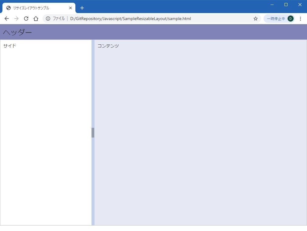
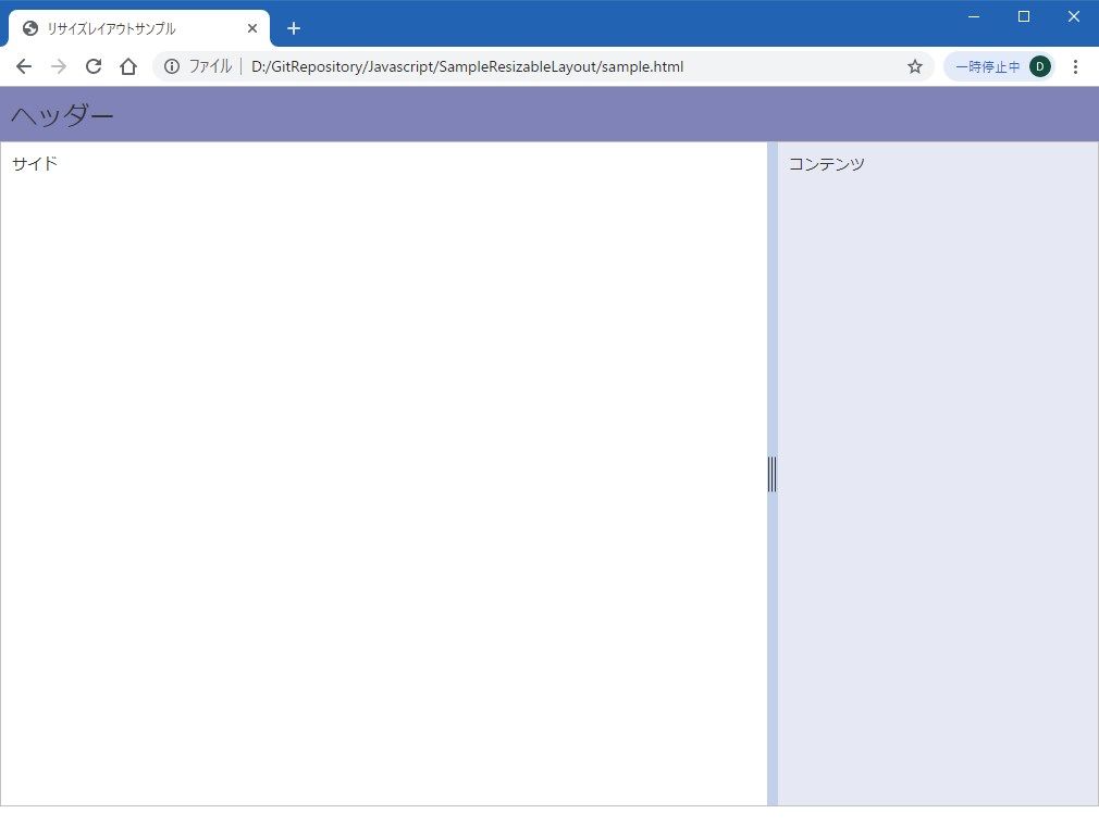
起動してみる
つまみをドラッグしてリサイズ。
まとめ
今回は左右の幅を調整できるようにしましたが、上下も可能です。
昔はこういったレイアウトを作るのに iframe を使ったりしたことがありますが、便利になりましたねぇ。
次回はテーブル列幅の調整もやってみようかと思います。
何かのお役に立てれば。
ではでは。